ERP System Design:
Tearing down information silos
The Brief
The client internally developed an ERP system to manage the workflow of its global network of kitchens, or units. The system had become antiquated and some units had adopted third party systems to accommodate their workflow rather than operate entirely within the client’s internal solution.
They had the need to standardize these units under a single, more flexible ERP system that could be catered to the unique workflows of its units while remaining centralized.
The Research
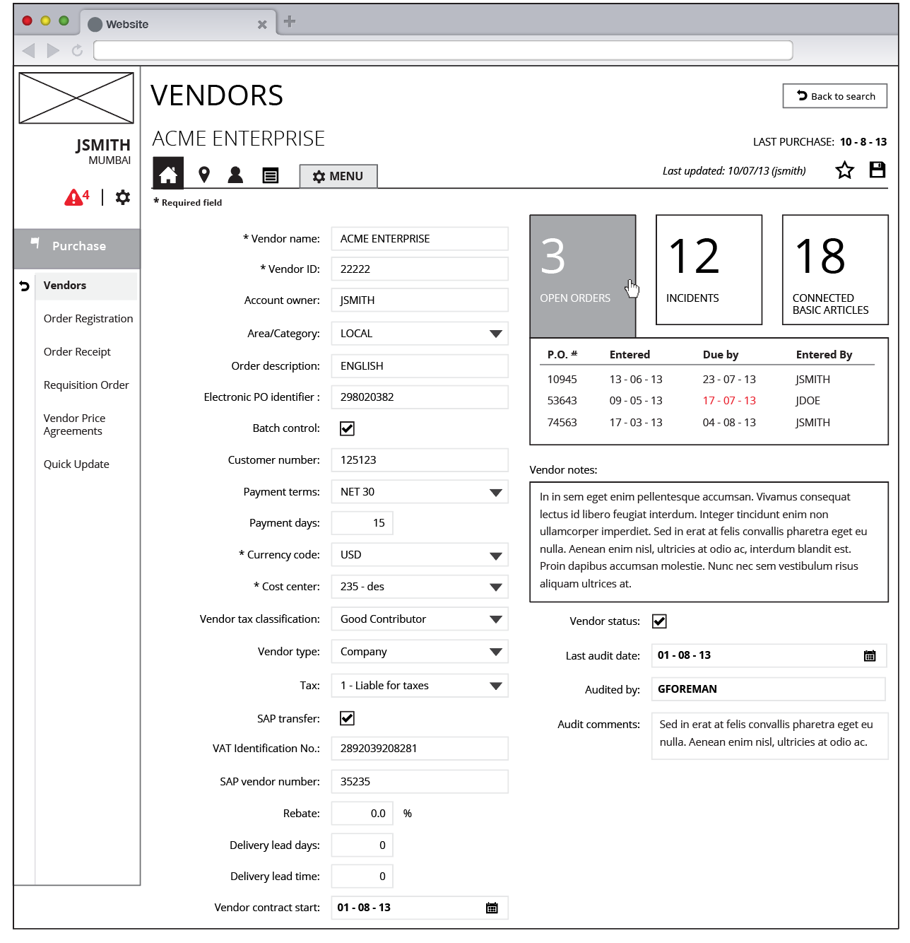
Approaching an ERP system from a research side poised an interesting problem in and of itself. With such a massive amount of functionality to work through, I used small, targeted user sessions to collect requirements and build up the stories and personas required to approach this from a user's perspective. These sessions took place throughout the duration of the project as we took on new areas of functionality. One section in particular that provided an excellent opportunity to demonstrate the value of a user-centered experience was their vendor interface. In the existing interface, the vendor module showed sporadic information on its surface. Recursive menus hid valuable information related to the vendor and it was difficult for a user to see any open orders that the company had with that vendor.

A dated layout gave little indication to user as to the vital details of the vendor they were currently viewing.

Recursive menus hid extremely valuable information, namely connected products and vendor incidents.
A complete valuation of the elements within the section was needed. Card sorting exercises with users who spent a large portion of time within this section helped gather valuable information and led to insights on how the interface could be drastically improved . With a considerable amount of overlap between users who are involved with editing/viewing vendor information and those who are involved with purchasing, I saw a large amount of users who would flip between these two modules while performing their daily tasks.
The Execution
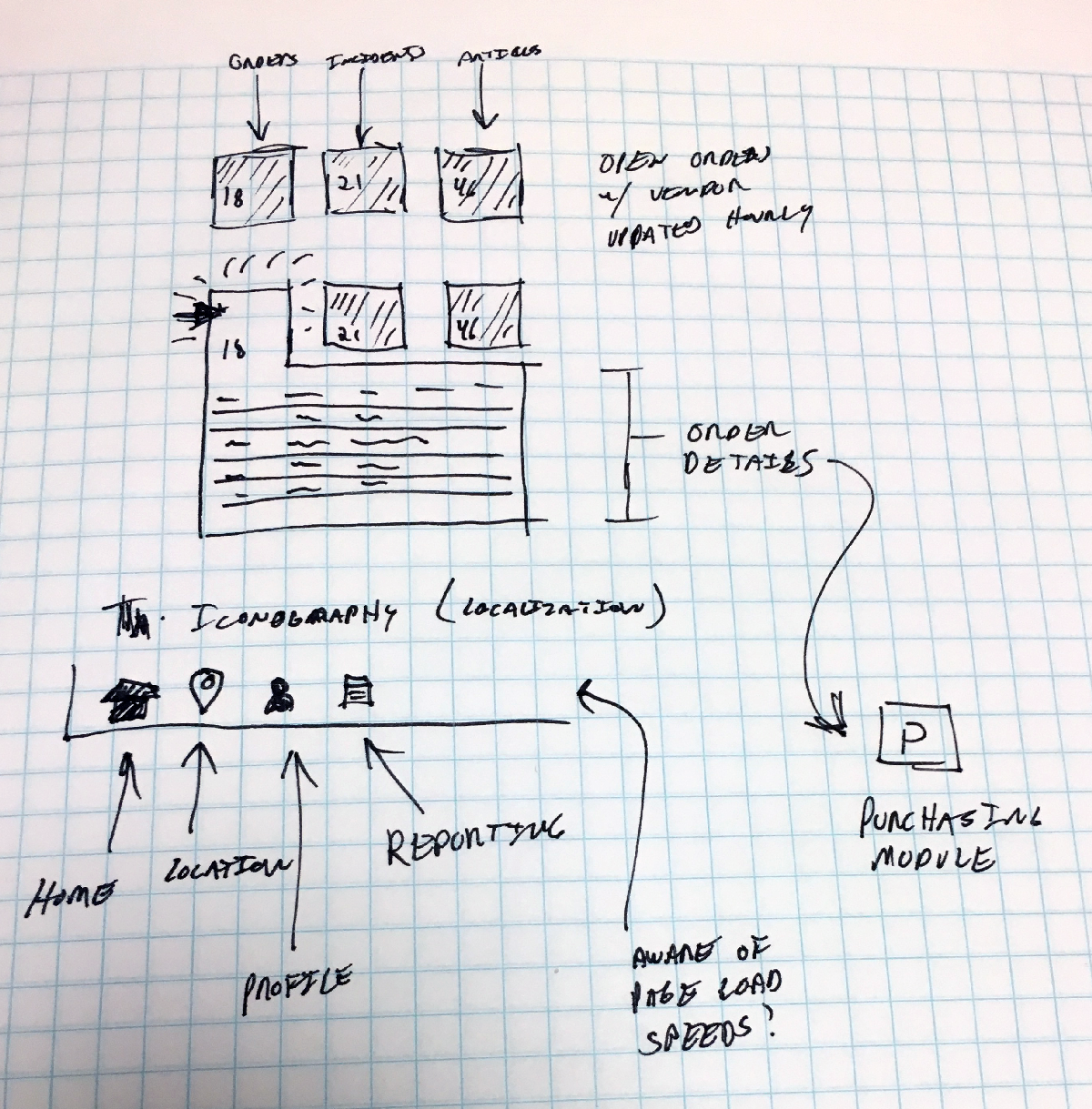
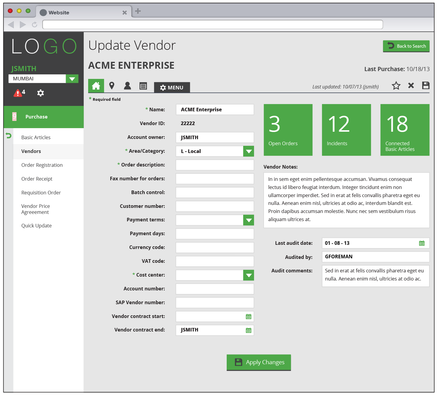
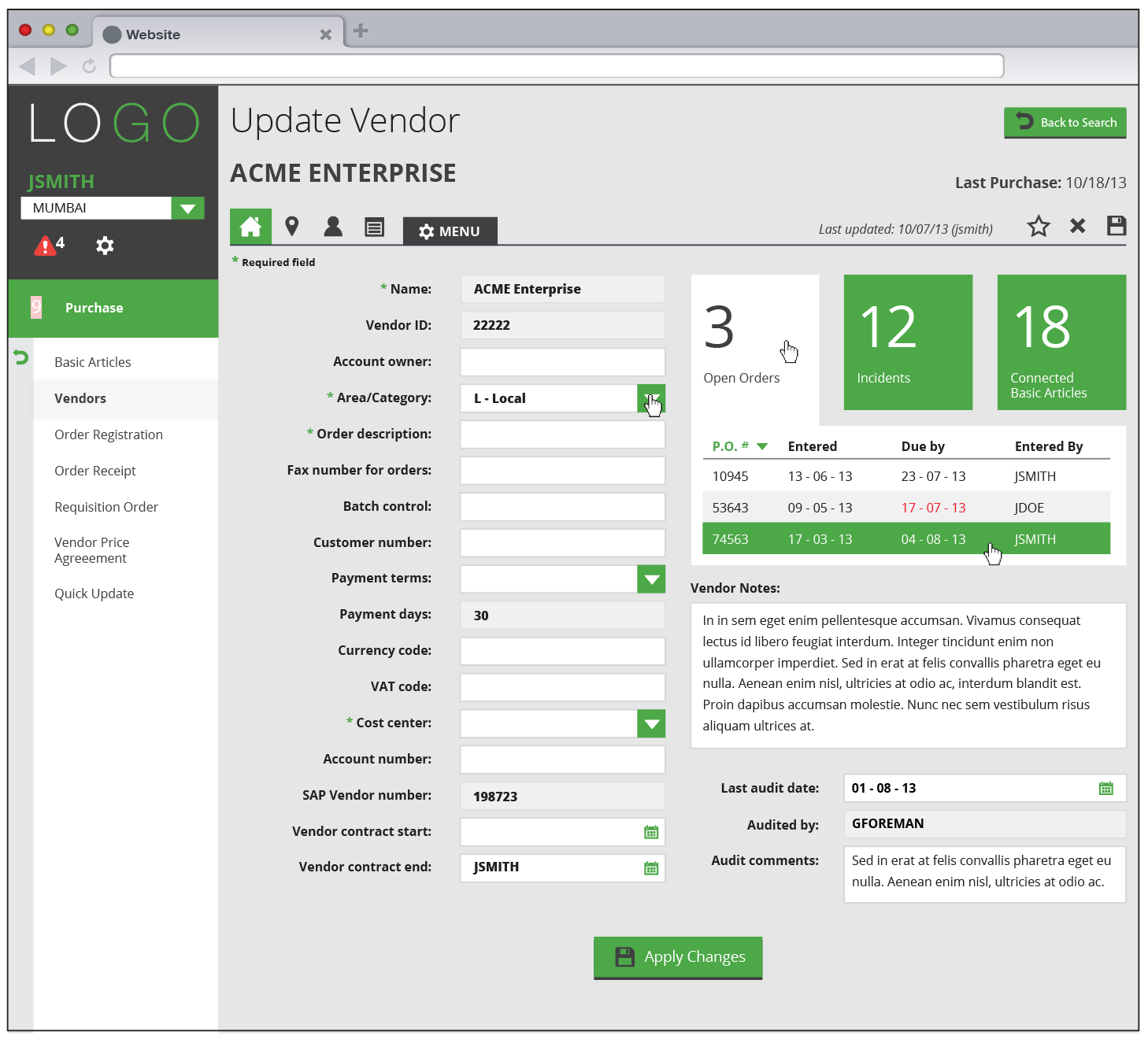
Recognizing that a dashboard for the vendor page would save these users valuable time in their search for vendor related details, I used the data collected in the research phase to learn what details the users are searching for within a typical session. The users wanted to know what products are connected to the vendor, what orders they have through them and the order details, and any incidents related to previous orders with the vendor. These details would then allow the user to quickly jump from the vendor to the related details should they wish.
Though a dashboard was not a client-defined requirement for this section, the opportunity called for a solution that spanned multiple information silos and connected them in a single page where the user can can quickly access them and move on to their next task.
The Result
In our user sessions revealing the updated vendor module, users were extremely excited in the ease of use of the updated interface. Frequent users reported a time-savings upwards of 20% throughout the time spent within this section. Further review sessions showed users frequently referencing all portions of the dashboard in their daily tasks. The dashboard exercise occurred toward the beginning of the project and established a precedent of approaching each new area of functionality with a fresh way of thinking.